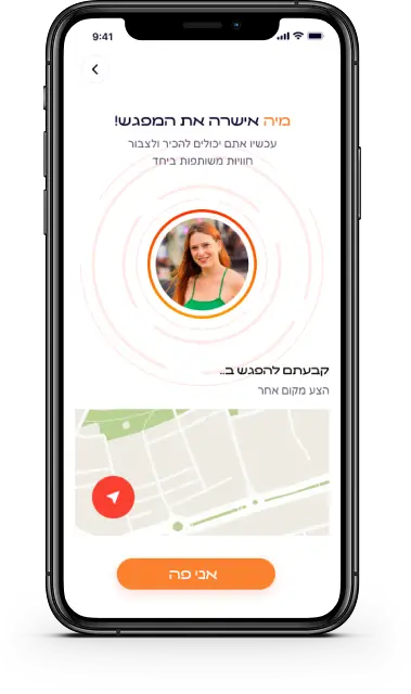
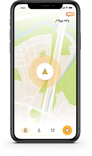
“Mipo” is a social app designed to foster spontaneous real-life connections between people in close proximity. Inspired by the idea that meaningful interactions often begin in everyday moments, the app connects users within a one-kilometer radius.
In a world where digital interactions dominate, “Mipo” brings back the magic of face-to-face encounters. The goal was to create an intuitive and playful experience that makes meeting new people feel natural, easy, and exciting.
Overview
When I began thinking about my final project, I remembered my first days in Haifa—new to the city, knowing no one, and wishing for a simple human connection. Just someone to share that moment of being new.
That feeling sparked a question in me: What if there were a way to create spontaneous, real-life connections between people who feel the same?
As I explored further, I realized loneliness isn’t unique to newcomers—it’s a shared, human experience.
That insight led to the creation of Mipo.
persona
Young adults aged 22-55 and tourists looking to make quick, platonic connections in their immediate area.
Roni
25 | Haifa | student
Needs / Goals
To find genuine, low-pressure ways to meet new people in her area, especially as someone who recently moved to a new city.
To feel a sense of belonging and connection through shared interests, spontaneous experiences, and real-life social moments.
Challenges
Struggles to initiate conversations with strangers on traditional social apps, where interactions often feel forced or superficial.
Feels overwhelmed by the loneliness that comes with relocating, and finds it hard to discover local social opportunities that feel natural and authentic.
Research
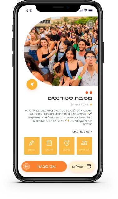
The first challenge was to find a way to design spontaneous social gatherings through a mobile interface.
I started my research by analyzing social apps like Tinder and Bumble, which focus mainly on romantic connections and appearance. I quickly realized that these platforms lacked the depth and authenticity I wanted to bring into Mipo. I then conducted interviews and surveys with young adults, students, and new residents in the city to understand how people experience loneliness and seek out connection. The insight was clear: people crave casual, real-life moments with others nearby. That’s why Mipo doesn’t start with a chat—it starts with an invitation to meet, based on proximity, shared interests, and walking distance.
That feeling sparked a question in me: What if there were a way to create spontaneous, real-life connections between people who feel the same?
As I explored further, I realized loneliness isn’t unique to newcomers—it’s a shared, human experience. That insight led to the creation of Mipo.
My next question was: what kind of real-life situations actually lead people to want spontaneous social interaction?
To explore this, I started collecting stories and behavioral patterns from young adults, students, and new residents. I created an Airtable chart where I documented various moments people described as “lonely but full of potential”—like sitting alone at a café, exploring a new neighborhood, or walking through campus between classes. I ended up analyzing over 60 different scenarios. I then categorized them into patterns of emotional need, timing, and social openness. These insights helped me define the exact context in which Mipo should suggest a connection—moments where people are both alone and open to something new.
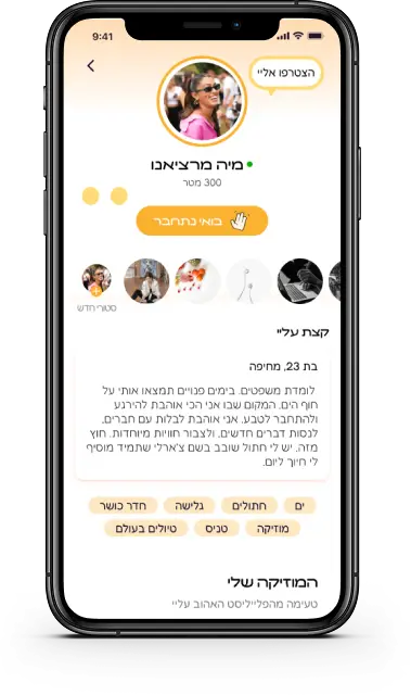
User profile
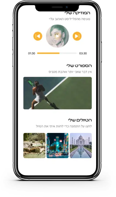
When designing the user profile for Mipo, I wanted to create a space that feels personal, warm, and alive. Not just a static card with a photo and a name, but a glimpse into someone’s world. That’s why the profile includes music, hobbies, favorite spots in the city, and even current moods. The goal was to spark connection through small, meaningful details—those that make us feel seen, understood, and open to meeting someone new.
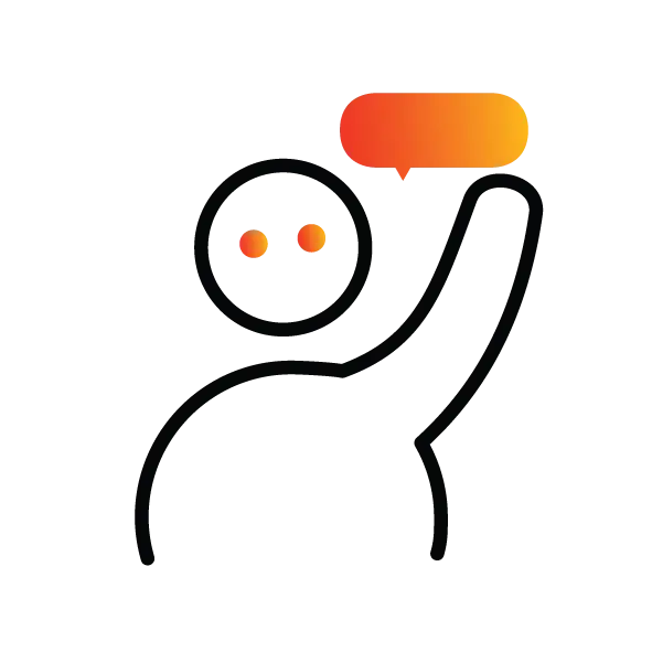
Custom Icons
I designed unique icon resembling speech bubbles and location pins, symbolizing communication and connection.
Color palette
The app was designed with orange, yellow, and blue to convey warmth, optimism, and trust.